Saturday, April 24, 2010
inspired by bronte part 3
This is the third installment in my "Inspired by Bronte" series of photo collages, created as part of Bronte-Along -- this time inspired by Emily Bronte's Wuthering Heights. I read the book years ago, and just finished re-watching the BBC version with the very fine and very smoldery Tom Hardy as Heathcliff. I want to go walking on the moors...
There's a link to all my Bronte-inspired posts here.
Labels:
bronte,
bronte-along,
graveyards,
heathcliff,
moors,
wuthering heights
Friday, April 16, 2010
light & abstract
This is the last assignment in the C&C Photography workshop, and this week I've been playing with light and abstract composition. I LOVED this assignment because I got to play with my favorite lens, the 50mm f1.8. The results that I get with this lens are always magical and I almost have to force myself to shoot with a different lens once in awhile. So, here is my exploration of light and abstraction.
Summing it all up: I really appreciated the opportunity to get out of my comfort zone and capture things from new angles. Having an assignment gave me discipline and focus, and being able to work on one aspect of photography each week really helped me to absorb the skill. The hardest assignment for me was the still life -- I was unhappy with the results until I simplified my vision and (literally) found the light.
Many many thanks to Camilla and Carolyn for leading this great workshop, and getting us to stretch our wings and fly! I can't wait for the next one (there IS going to be a next one, right?) and would be happy to help if you need it.
PS: I took the photos in my previous post as part of this assignment, but I couldn't part with any of them, so I posted them all! Consider them a bonus parting gift. :)
PPS: I'm heading out on vacation tomorrow and I won't have access to a computer, so I will comment on your blogs when I get back next weekend. Thanks so much to all of you for sharing your amazing work (and a peek into your lives) with us -- it's been a truly wonderful experience.
First, get ready for a close-up (or three!).
How about a different angle?
Here's a reflection -- of me!
Let's look up -- a landscape....or rather, a skyscape -- so many gulls!
(Click the photo to count them all)
Finally, here is some golden deliciousness that to me defines spring
and gives a hint of summer yet to come.
Summing it all up: I really appreciated the opportunity to get out of my comfort zone and capture things from new angles. Having an assignment gave me discipline and focus, and being able to work on one aspect of photography each week really helped me to absorb the skill. The hardest assignment for me was the still life -- I was unhappy with the results until I simplified my vision and (literally) found the light.
Many many thanks to Camilla and Carolyn for leading this great workshop, and getting us to stretch our wings and fly! I can't wait for the next one (there IS going to be a next one, right?) and would be happy to help if you need it.
PS: I took the photos in my previous post as part of this assignment, but I couldn't part with any of them, so I posted them all! Consider them a bonus parting gift. :)
PPS: I'm heading out on vacation tomorrow and I won't have access to a computer, so I will comment on your blogs when I get back next weekend. Thanks so much to all of you for sharing your amazing work (and a peek into your lives) with us -- it's been a truly wonderful experience.
Labels:
abstract,
candc photography,
flowers,
light,
sky
the essence of spring
Thursday, April 08, 2010
tell me a color story
This week's C&C Photography assignment is to tell a color story. My color is green and my story is spring/cleaning. I used bits of red as green's complement. In my photos I've juxtaposed the first sprouts of spring with a day of spring cleaning, including tidying, dusting, garage clearing, a trip to the dump, and car washing. The person shown feeding the gulls is my father - it's a photo of a framed photo of him from the 1960s -- I gave him a good dusting while I was at it!
Sunday, April 04, 2010
inspired by bronte part 2
Here are some more images inspired by reading and watching the Bronte sisters, as part of the adventure that is Bronte-Along. These are photo collages I created using some of my own photos and also photos and textures gleaned from creative commons. This time they're inspired by Anne Bronte's The Tenant of Wildfell Hall. The lonely house, the sheep in the mist on the moors....I really liked the imagery.
There's a link to all my Bronte-inspired posts here.
Labels:
bronte,
bronte-along,
eggplantia,
fog,
mist,
moors,
sheep,
tenant of wildfell hall
Friday, April 02, 2010
still life : composition and perspective
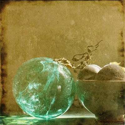
It's C & C Photography's 2nd photography assignment, and the focus this week is composition and perspective. So I gathered together some beach stones, seaweed, shells, a bowl from Ron Dean pottery, a witch ball, and a little sequined ball. I arranged them on a painted nightstand, with the afternoon light coming in the window. I used 3 different lenses to achieve these effects. I did my photo editing using Picnik.
I took two other series of shots using different objects -- the first set (beach finds) was too busy (too many items) and the light and setting were wrong. The second set (toys outdoors) was cute but not really still life material-- more like a series of portraits.
I have to say I love the results of this assignment. The light was perfect, and the different textures and tones really helped. I like that because of the textures and light, the monochrome shot is interesting as well. Thanks to Camilla and Carolyn for another great learning experience.
Monochrome
I'm throwing in a few bonus shots, just because I couldn't leave these behind on the cutting room floor.
I took two other series of shots using different objects -- the first set (beach finds) was too busy (too many items) and the light and setting were wrong. The second set (toys outdoors) was cute but not really still life material-- more like a series of portraits.
I have to say I love the results of this assignment. The light was perfect, and the different textures and tones really helped. I like that because of the textures and light, the monochrome shot is interesting as well. Thanks to Camilla and Carolyn for another great learning experience.
Subscribe to:
Posts (Atom)